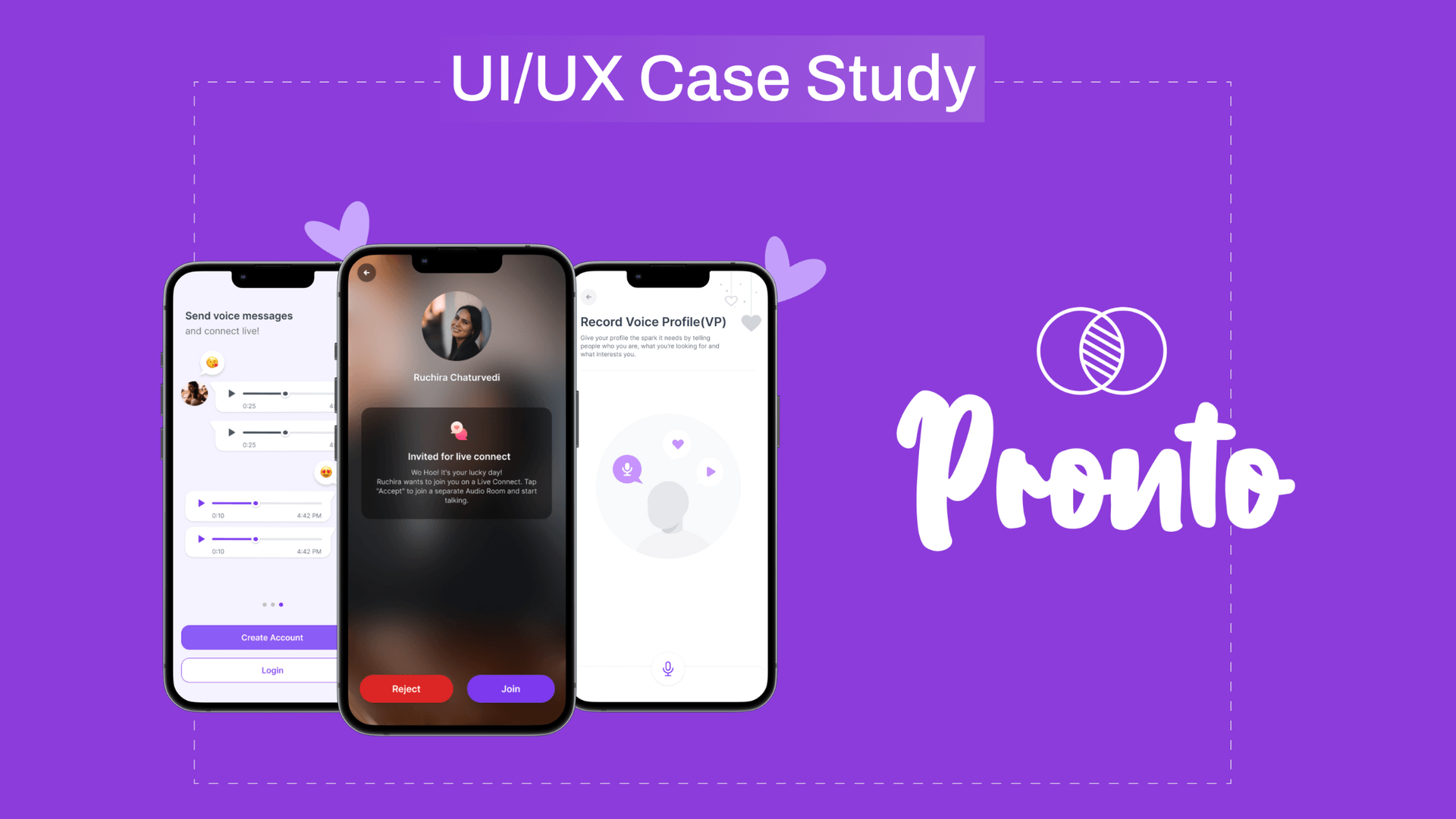
With over 51 percent of unmarried Indians drowning in an ocean of swipes and winks, Pronto offers a lifeline with a bold, new move in the dating world. It's giving the Indian dating scene a much-needed jolt of espresso with its unique feature - voice sharing!
Far from the old-school dating sites, we're currently opting for, personalized dating experiences, with Voice Profiles and Messages, will prove to be a helping hand for users to tune into real connections amidst the chaos.
India's on the fast track to dating app spending, ranking 5th worldwide, and Pronto's on a mission to tap into this treasure trove of potential. The success of voice-based matches is expected to create a buzz, increase user activity, and make Pronto the favorite app on every single Indian's phone.
But, as we all know, love is never straightforward. So naturally, we encountered several challenges while developing this app. However, unlike our (complex) dating lives, we managed to solve them all.
Design Process

Challenges & Solutions
Behind the Scenes
Our developers, a.k.a. Pronto’s app scientists, now had a massive responsibility. With tasks including continuous production release dissections, device compatibility trials, experience audits, accessibility assurance, and optimizing performance, they aim to craft an app that feels like love at first sound. This dedicated work by SoluteLabs developers is to make Pronto’s marketing team's job a breeze.
Webpage: The Love Billboard
SoluteLabs also created a one-page promotional website with a UX copy smoother than a pickup line from Casanova. The goal? To design an interface that's a head-turner, fostering organic growth that outshines the competition like a disco ball at a backyard party.
So, what was SoluteLabs' recipe for cooking up this highly impressive dating app and ensuring it is up and running efficiently?
Competitive Analysis
We did a Competitive analysis to evaluate how our design stacks up against competitors. It involves comparing design elements, user experiences, and messaging to identify strengths, weaknesses, and opportunities for improvement.
Difference between Bumble and Tinder, Pronto's Competitors:
| Parameters | Bumble | Tinder |
|---|---|---|
Strength |
|
|
Weakness |
|
|
User Profile

Pronto's User Flow Diagram

Style Guide: Designing Love
Colors
We aimed for a color palette that screams "royal and luxurious" but also whispers "trust me, I'm reliable." So, we sprinkled the magic of the purple family throughout the app. But why purple? Often caught mingling with elegance and sophistication, purple is a perfect match!

Typography
As for typography, we swiped right on the "Inter" font family. This font is the full package - versatile, flexible, and with a range of weights that would make any fitness instructor jealous. By sticking to this one font family, we ensure that our app isn't just about finding a match, but also about matching itself - a visually harmonious experience for our users.

Logo

Wireframes

Modules
1. Onboarding
"Hello, Pooja Speaking!" Ayushmann Khurrana’s famous dialogue from the movie Dream Girl showed us how we can fall in love with a voice.
Our research, surveys, brainstorming sessions, and after swiping left of multiple clichés, we managed to find our star attraction - Voice Notes. More personal than a text, more mysterious than a picture - the perfect way to connect soul mates!
At the first app launch, users learn how to discover their ideal match for engaging in conversations, connect with nearby people in a meaningful manner, and send live voice messages for real-time connections.
P.S.: Don’t worry, our awesome backend team has ensured that no wannabe Ayushmann Khurranas pose as Poojas on the App.

Profile Setup
Pronto’s registration is like an icebreaker at a party. You just need to enter the very basics: name, location, and preferred language and the app will customize the experience for each user. With voice technology, we're adding a dash of 'real' to the virtual, cranking up the fun, and redefining 'user engagement'.

2. Sharing Voice Notes
The App’s UX Copy acts as a perfect wingman for you! It offers quick-witted and informative messages that help users grasp new features smoothly. This jazzes up user engagement and sparks joy in their app experience, leading to a happily ever after with Pronto.

3. Live Connect!
The App’s UX Copy acts as a perfect wingman for you! It offers quick-witted and informative messages that help users grasp new features smoothly. This jazzes up user engagement and sparks joy in their app experience, leading to a happily ever after with Pronto.
To make the journey of love smoother, we've revamped the app's layout like Sima Aunty from Indian Matchmaking, grouping options like compatible interests. Moreover, we've organized our card designs and tidied up the data points as per the visual hierarchy, just like arranging profiles based on your preferences. This uniformity and aesthetically pleasing detail presentation contribute to an effortless and intuitive romance expedition on our platform!

Website UI: The First Base
Our team whipped up a one-page promotional website that spotlights the app's features. We opted for a laid-back, relatable copy with a hero section that highlights the app's wide reach in the digital dating playground across various platforms, making it a breeze for users to locate and download our app.
The website is built with the seeds of growth in mind. Incorporated are -
- Founder's letter, giving users a glimpse into the heart and soul of Pronto, and
- Real love testimonials, provide the kind of social proof that would make any skeptic believe in love.
These design elements are all about creating a heart-to-heart connection, encouraging authenticity, and getting users to fall head over heels for our app.

Our exceptional UI/UX Design team finished the entire design process in just 18 days, i.e. an average length of a whirlwind romance.
At SoluteLabs, we're experts in making apps that people love. We can create a dating app that's unique and exciting, just for you. Get in touch with us now and let's make your app idea a reality.
