Why connecting emotionally with users, gives your product an edge over competitors
The relationship between your product and your customers is a lot like an intense love affair….
Getting them to rave about you feels good? Yes, it does!
Having them talk about you is nice? Yes, it is!
All praises, no complaints feel peaceful? Yes, it does!
Having them choose someone over you hurts? Yes, it does!
Abandonment stings? Oh hell yes, it does!
So how exactly do you make sure, things stay ideal between you and your audience?
Well, you do exactly what you would have done, to make your mate stick to you —
- Connect with them at a deeper, subconscious level.
- Be interesting and engaging, now and forever.
- Delight them now and then with something that they didn’t expect.
- Realise that there are hundreds of other similar products, that do exactly what you are doing….and you need to stand out.
Emotional sustenance in digital products is deeply tied to UI/UX design, ensuring that users not only engage with a product but also feel emotionally connected to it.
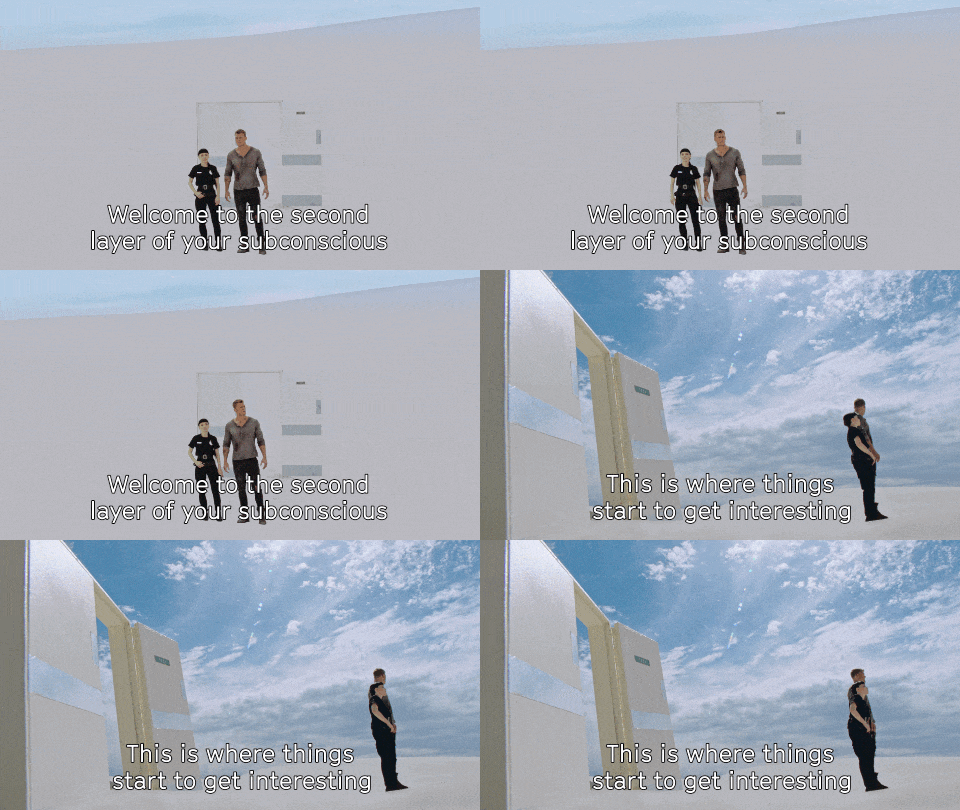
According to Gerald Zaltman, a well-known Harvard Professor, 95% of our buying decisions are sub-conscious.
(Source — https://hbswk.hbs.edu/item/the-subconscious-mind-of-the-consumer-and-how-to-reach-it)

Designing, keeping in mind the emotional needs of your customers, helps you achieve all of the above. In this write-up, we explore, how emotion design can play an integral part in your sale cycle and your product life.

This emotional design pyramid is a good adaptation of Maslow’s hierarchy pyramid. Clearly, ‘pleasure’ is as important as self-actualisation, but is, sadly, the most neglected aspect of app UX. Focusing more on the ‘pleasure and emotional actualisation’ spots of your users keep them absolutely loyal to you.
One of the most mindfully, emotionally designed apps that I have come across and use regularly, is Headspace. I love the intuitive interface, I love the characters, I love the language….in a nutshell, the app promises to help me find peace, and peace is what I find when I use Headspace.
It would be good to mention here, that I am sort of a beginner with meditating and mindfulness. And Headspace is something, I found, enhances my meditating capability. I am sure there are other great apps out there… Muse and Waking up with Sam Harris, a couple of them. Both of them, I have heard, are good for even the ones that are experienced with meditation.
Calm is another app that I have used for some time, but somehow, I ended up falling in love with Headspace. (I guess the adorable graphic, warm colour tones and the metaphors used throughout in the guided sessions helped me come closer to my own mind.)
Through this post, I will take up subtle little things here and there (from the perspective of intuitive design), that come together and make Headspace my retreat, after a tiring day.
The purpose:
I warmed up to the concept of mindfulness and meditation some time ago. The reasons were a lot like what many others like me have — long hours of work, stress, a wandering mind, attachment to devices, stuff of that sort. I read a bit, asked people about what they were doing and the next thing I knew was, I had a couple of apps on my phone.
I used them and Headspace is what has stayed with me.
It’s important for me to find myself in an app that I am using….either my present self or my future self. Somehow, every app we all use in our day to day lives, reflect our personalities. Headspace reflected a huge chunk of what I wanted to become.
The logo of the app is a round orange coloured dot….easy to locate on your screen, resembles a focal point, and gives a sense of warmth and belongingness.

Here are the ways, how I, despite being me(a techie guy myself, extremely curious and quick to change to new things), still have Headspace installed on my phone. It is an excellent example of emotion design.
The routes:
Headspace has used a combination of certain core design elements very well. These core elements, combined with the context of the sessions spoken on by Andy, make those 5 minutes of sitting still, sort of an experience for me.
And I look forward to repeating it. So Headspace is doing its job! It’s making me want to make meditation, a habit.
Here are the core UX and UI elements that I am talking about.
1. Flow
Smooth navigation of users through an app is super-important. That means
- Don’t take them to unnecessary screens, just because you have to show some information
- Don’t make them do tasks that they are not yet warmed up to do.
- Give options and a clear pointing to rewards.
Honestly speaking, Calm had me over initially with its ‘take a deep breath’ welcome. It was peaceful to look at the screen and move on to the next screen.

Headspace, I would say, is a bit busier when it comes to its welcome content & emotionally designed UX. But over time, I started getting used to the busy screen….specifically because, it lets me get access to what I want to do, right on its home screen.
The flow throughout the app is very intuitive. While you get everything that you might be looking for at one place, there is no way that you can call Headspace screens cluttered. The intent behind each course is clearly stated. So you tap on exactly what you need.
2. Colour
That’s the best part of Headspace. The palette is warm, welcoming, goofy, with a hint of calmness attributed to, by blues and greys here and there.

A lot of other mindfulness apps, in my knowledge, go for a cooler shade with tones of blue. While somehow blue has a calming effect on our brains, I personally feel it has become the universal colour….widely used in the IT and finance sectors also.
I prefer the colour tones of headspace because it gives me this intangible feeling….a feeling of being at home in my own self. no matter where I am, headspace makes me feel like am in my pyjamas, completely in control of my breath, relaxed and resting well.
3. Graphics
What feels good to the senses, stays in the conscious.
More importantly, what looks good, breeds adoration and induces attachment. Ohhhh yeah! Isn’t that what we all want?
For some reference, (kidding! for some entertainment), here is a little something:

Alright, on a serious note now, the sole aim of graphics is to help your users find out stuff easily, take actions quicker and if nothing else, relate to your brand better or maybe, undergo a change in ideology and embrace veganism.
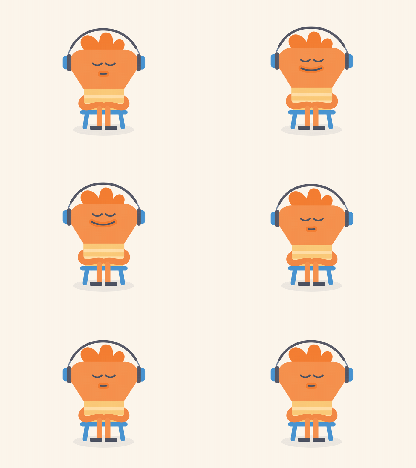
As far as headspace is concerned, I am totally in love with the illustrated characters of this app. Emotion design at its best, I would say!
Looking at my orange man, particularly, calms me down. This, in contrast to the interface of Calm, which does not have illustrations, and rather uses nature themes as backdrop scenes.

In my opinion, having those long-limbed funny cool characters doing random little happy stuff on my screen, makes me want to be a part of them…It might be laughable, but a lot of times, I find myself at peace, when I look at them.
The orange man is my favourite.
4. Animation
You know, as a digital product guy, I have come across a lot of people that just pick up ideas and want them to be don’t for themselves too. I always end up asking them, ‘why’. Use of animation is one among these ‘why’ questions.
- Why do you use animation?
- What value will animation add to your product?
- What is the right way to use animation?
This amazing piece gives you every bit of information that you would need before contemplation animation for your product.
I recommend, take a read before I take you back into my take on the Headspace’s beauty of animation.

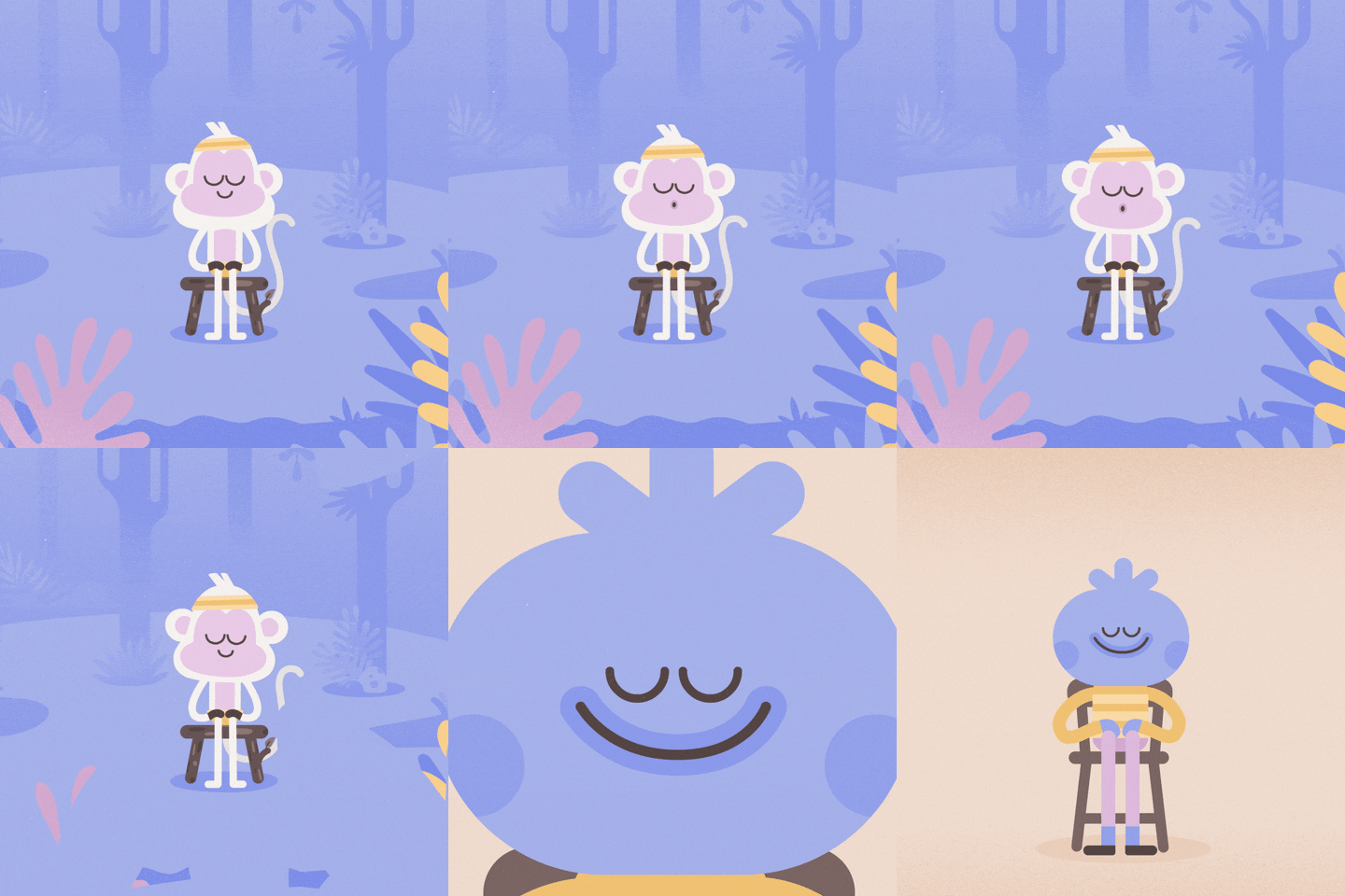
An awesome thing about Headspace is, you won’t find animations scattered all through the app. It is used quite in a balanced manner when the guide talks about a particular subject and wants you to relate with him better. The above animation, for example, is about the comparison between our minds and monkeys.
The animation, along with the soothing voice of the speaker, helps you connect well and tune into a calm mode automatically.
There is absolutely no prominent animation, during a meditation session. If at all you happen to look at your screen while meditating, you only see a pause button and a few shapes moving subtly in the backdrop — perfect set-up to make you close your eyes again, or pause the audio….either continue meditating or stop it..no way to get distracted.
Calm, on the other hand, uses only audio stimulus to get you focused. That’s the same even with stories. That has a positive though…it gets super easy to sleep with Calm. The night stories feel like a lullaby, which I think, is one of the sole aims of Calm.
5. The language and tone
Empathy goes a long way in connecting with your users. There is no better way to create empathy, than through tone and language.
Go through this post, if you want to understand me better here.
I love the way Headspace does it….creates empathy….the metaphors, the liberty to get distracted sometimes without getting beaten down, the concept of noting, everything that the guy talks about. Headspace users will connect with me here.

The micro-copy, on this screen, for example, encourages me to show self-love. Now self-love, if you are not aware of, is a popular concept among self-improvement enthusiasts nowadays. There are complete blog posts written on self-love…there are tons of books. And here, there is a short statement that induces me to indulge in it.
The app is showered with a lot of such quality micro-copy, that is designed to connect instantly with the user and create a sense of trust and happiness of finally having found something truly useful.
6. Purchase points
Headspace is not a free app, though there is free stuff available for beginners. Slowly, you will have to subscribe to all the paid stuff, and I have found all of it completely worth.

The point is after I started using Headspace, I never felt the pressure to purchase the paid libraries. The gradual purchase trajectory that they take their users on, from being free version users to paid users, is excellent.
While the user knows that at some point, they will ultimately have to be a paid subscriber, it does not feel like a clingy app that has an ulterior motive to make you pay.
The use of the word ‘unlock’, for instance, is very wise. It drives curiosity in the user, unlike a lot of other apps that put it as ‘Subscribe to enjoy this feature’.
How strong is my relationship with Headspace?
So far, so good. I was loyal enough to have bought their paid features and I open the app at least twice a day.
To any app maker, that is the ultimate aim after getting downloads — have the user use your app daily, out of sheer habit.
The conclusion:
Headspace, according to me, is a good example of how an app can have a considerable screen-life for its users if it is designed in an emotionally intriguing manner.
What more can I say? I would continue using this app, till I have to functionally switch to a more advanced meditation app or seek a spiritual guru. But till then, I am completely satisfied with what Headspace does for me every day — take me back inside my head and help me find peace and quiet.
I doubt, the impact would have been the same if it were designed anyhow else.
I’m a developer turned entrepreneur, who tweets, blogs and runs a dev shop around developing products that are used by millions!
